I thought that title might get a little interest. As it turns out my alternate names range based on my anagram are:
Della Sir Owl to Ladle Sir Owl to Ordeal Wills to Dare Ill Slow
So, what's your alternate name?
Wednesday, June 08, 2011
Monday, May 02, 2011
Dalston Street Artist -Stewy - Does Tea Parties
About 3 weeks ago, I woke up to a horse outside of my window. Unlike our home in Primrose Hill, it wasn't a real horse, but it was still beautiful. Here's what it looked like:

there was a frog too.
About a week later, a horn was added and it became a unicorn. Unfortunately, I was a little slow to capture that transition on film because not more than a few days later some wings were added. I made sure I got that one on film (*ahem* digital I should say)

I was planning on making a short post about this unexpected surprise and that would be that. However, last weekend, a little tea shop and art installation (Urban Fog) popped up beside my winged unicorn in a soon-to-be renovated building. It turns out Stewy (see more of his work here) collaborated with the team at Urban Fog and added some animals announcing the tea house. I thought I would document these wonderful additions here as I am sure it will all soon disappear when the renovations begin.


More about the Tea House ...
The owner - Zoe - decided to use the space to create a wonderful fabric installation. It feels like you are inside a modern day cave with little cubby holes where you can sit, enjoy music and tea. You can read more about the concept and installation on their website.


So, if you're in Dalston before May 21, 2011, you should check out Stewy's and Urban Fog's work. (opening times are on their website)
Thursday, February 03, 2011
My Beautiful Network of Professional Contacts
Last year Dopplr sent to its users a beautiful map which outlined their business travel for the previous year. Here is an example of the map they did for Barak Obama for 2009. As you can see it was a really beautiful way of presenting data.
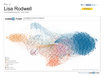
It seems that Linkedin has been taking a page from Dopplr's playbook. And, they've done a brilliant job. I now have a visual map of my Linkedin connections. The colours represent connected networks. If you create your own, you will see that you can decide who the colours represent by scrolling over the dots to expose the individual people.
I was surprised to see that the majority of my connections in Linkedin were associated with my time at Yahoo! This is incredible given it was only 2 years of my rather lengthy career. I guess I made lots of contacts during that time.
I'm now thinking I love my map so much I might make a set of MOO business cards with my personal map printed on them.
Go on make your own!
Subscribe to:
Comments (Atom)


