Thursday, February 03, 2011
My Beautiful Network of Professional Contacts
Last year Dopplr sent to its users a beautiful map which outlined their business travel for the previous year. Here is an example of the map they did for Barak Obama for 2009. As you can see it was a really beautiful way of presenting data.
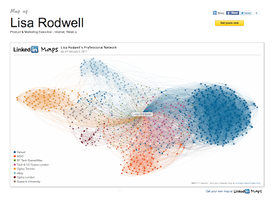
It seems that Linkedin has been taking a page from Dopplr's playbook. And, they've done a brilliant job. I now have a visual map of my Linkedin connections. The colours represent connected networks. If you create your own, you will see that you can decide who the colours represent by scrolling over the dots to expose the individual people.
I was surprised to see that the majority of my connections in Linkedin were associated with my time at Yahoo! This is incredible given it was only 2 years of my rather lengthy career. I guess I made lots of contacts during that time.
I'm now thinking I love my map so much I might make a set of MOO business cards with my personal map printed on them.
Go on make your own!
Subscribe to:
Posts (Atom)


